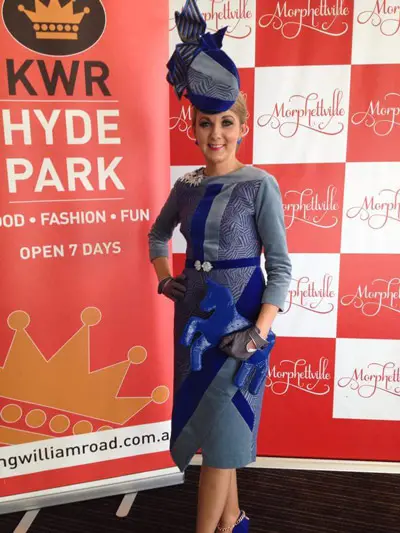
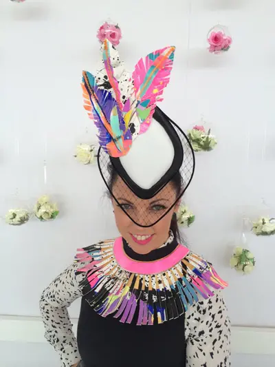
One of my FAVOURITE, fun things to do is clashing prints!
I’m drawn to the playfulness of it, to experiment and see what random prints work well together. Of course, I find it immensely satisfying when they do.
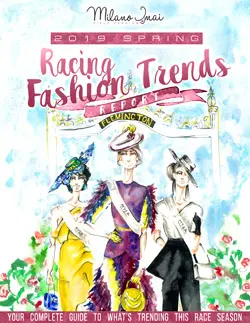
Clashing prints is a quick and easy way to update an old outfit and is becoming a big trend in racing fashion and Fashions on the Field competitions.
The best part is there are no real rules. You will need to develop an eye for what works and what doesn’t, but really, you just never know till you try!
Choose Colours that will Clash Well
My first tip to successfully clashing prints is to have a good understanding of colour.
Look at the humble colour wheel to find harmonizing colours, as well as contrasting colours (those on the opposite side of the wheel). Colours next to each other work well too.
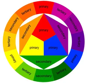
Those colours you think wouldn’t normally work well together, actually do.
Brown and turquoise, orange and navy, pink and red, chartreuse and blue and green and purple are some of my favourites to clash!
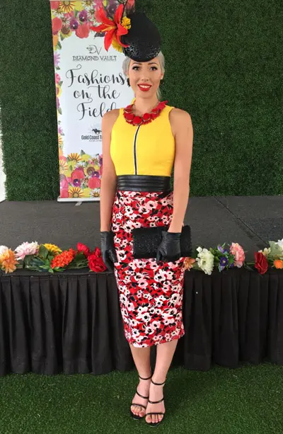
When faced with a Surf Life Saving Day theme race event, I had to deal with red and yellow; a combination I really didn’t think would go together. But, I was surprised to find it worked really well when a print was incorporated.
You can also check out runway shows and top designers to see what colours they are pairing together.
Sometimes focusing on matching the colour rather than the print works well too. Click here for some of my other tips on how to choose the perfect colours.
Now for clashing PRINTS, there are plenty of options!
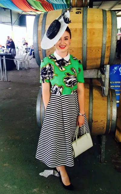
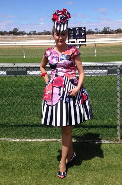
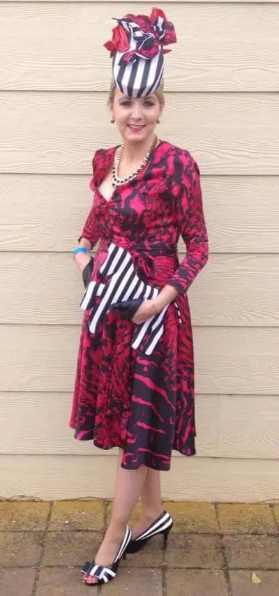
1) An easy place to start is to clash prints with stripes.
A nice striped blouse paired with a floral or animal print works beautifully as seen here on Georgia, winner of Oaks Day 2015.
Or vice versa as seen here on Bec.
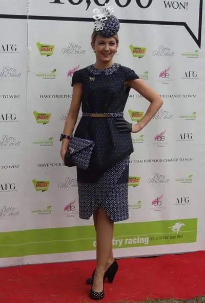
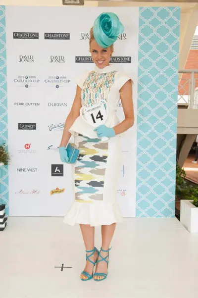
2) Combine big and small patterns/prints.
Wear the same print, one version being larger than the other, like Crystal’s leopard print ensemble below.
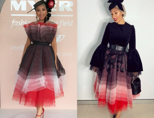
This also shows clashing prints in monochrome for maximum effect!
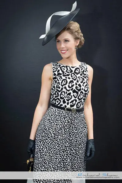
Photo by race photographer Richard Shaw.
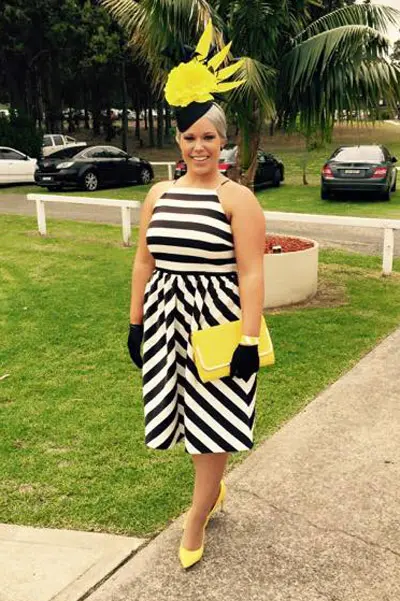
3) Wear the same pattern in two different ways.
A horizontal stripe next to a vertical stripe is very effective as shown here on Emily, especially with the pop of colour.
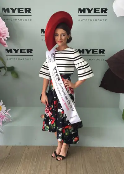
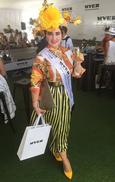
4) For those who are a little more daring, try clashing two bold prints.
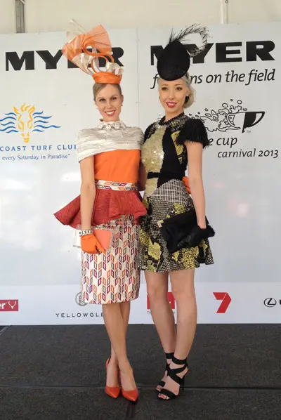
Our brave Queensland Myer FOTF State Finalist Inessa won wearing a striking print-clashing ensemble in yellow and orange.
She clashed a stripe full skirt with a printed Versace blouse and accompanying stripe bag.
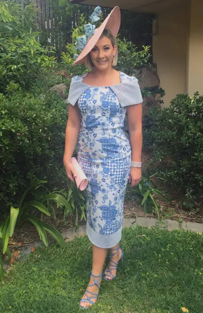
5) Wear one dominating print mixed with an accent print.
Kerrie wears an amazing dress by Milva Carruci Designs. The floral print being the dominant print and the mesh the accent. Love this blue!
6) Clash two of the same print, two florals always look amazing.
Note Jen’s subtle print clash of the floral fabric in purple slipped in there.
7) Use the same print in contrasting colours.
Crystal is wearing the same paisley print in mint green and blue. I love the shiny fabric.

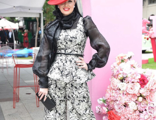
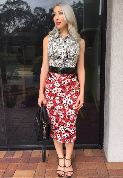
8) A personal favourite is animal print mixed with black and white.
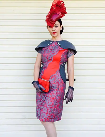
9) Clashing your fabrics can be very eye catching.
Kacey‘s use of lace, leather, and stiff fabric has an overall appeal to the eye and stands out.
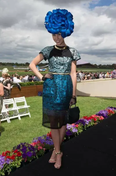
I also consider mesh a print, one I love to mix into outfits as shown below. I share how I made this outfit in my post about the Girls Day Out Race Day.
10) Choose two prints with the same colour scheme.
Jen wears different prints with the same navy, blue and white colour scheme.
11) You can use a belt to separate your prints.
This also helps soften the variation between the two patterns and colours.
Sorry, I know this isn’t a race outfit, but I was strapped for photos :) I do like this combo though!
12) Mix a print in with a few different fabrics/colours.
13) Combine a monochrome outfit with a pop of colour.
Kacey put together this fabulous original ensemble that really stands out.
14) Mix prints of different scales like small polka dots with big stripes.
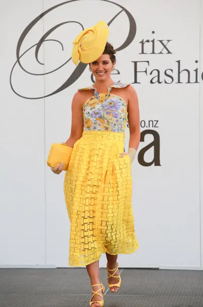
This floral print looks great with the contrasting rectangular pattern in the skirt fabric as seen on Carena.
15) Clash soft pastels for a muted toned down but still effective clash.
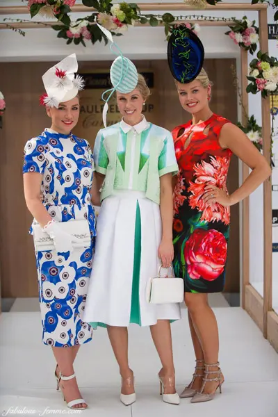
Photo by Fabulous Femme.
16) Pair a bold print with a neutral colour to tone it down.
17) Clash two prints sewn into fabrics.
Jen wears a jacquard and embroided fabric for a subtle contrast.
18) Use the same colours in two different prints.
19) Wear a pre-mixed print.
You can’t go wrong here, the work is already done for you! Love the big bold prints in Jen’s dress.
If you are still unsure of achieving a successful clash, ease into it- you can start off with a printed shoe or bag as a feature.
So who is ready to embrace the wide world of print clashing? It’s so much fun. Give it a go at your next race event – or BBQ, or night out… whatever!
Let’s continue the conversation in the Field Fashion Community Facebook Group – I’d love to see photos of your clashing print outfits.